TASC |  Dublin, Ireland
Objectives
Findings
Question
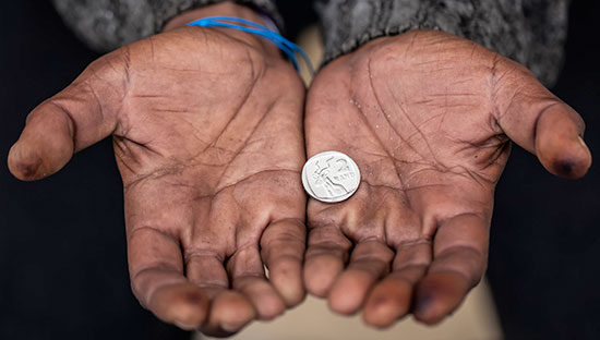
TASC’s mission is to produce policy analysis and present evidence-based proposals for the achievement of a more equal, flourishing society with accountable government and strong, responsible public engagement. TASC’s work focuses in particular on proposals to reduce Ireland’s high and persistent level of economic inequality and to develop the genuine participation of people in decisions that affect themselves and their society, as well as an overall commitment to promote social equality and non-discrimination including the nine grounds in the Equal Status Acts 2000-2011.
One of TASC’s key challenges is around taking the information available to them through publicly available sources, and making it undertandable for the public, policy makers and key decision makers. Therfore the challenge that was set out for the volunteers at DataKind Dublin’s first DataDive was to find a way to process and visualise the data to make it more accessible so that people can make better informed decisions.
What Happened
The TASC project was challenging on a number of fronts, as the team was primarily trying to build a narrative around disparate sets of data and find a way to present them in a coherent way to educate the public about inequality in Ireland.

Our volunteers tackled the challenge head-on, diving into the mountains of publically available data on the topic both in Ireland, Europe and the OECD. While a great deal was initially discussed and gathered, spirits began to flag slightly early Saturday afternoon when the complexity of the problem emerged. How could the team make the analysis relevant for the audience without recycling work that already existed?
The Data Ambassadors referred to the project management 101 playbook and looked at the individual goals of the team for the day, redistributing the work accordingly. The team regrouped and attacked the problem with vigor so, by Sunday afternoon, the struggle was complete with the battle-hardened DataDivers completing some very impressive visualizations. [So how did they ultimately overcome this challenge? Was it in deciding to narrow their focus to housing?]
Ultimately, the team found a relationship between inequality and housing prices in Ireland. While Ireland is financially supportive to lower income individuals, the cost of living is significantly higher than other OECD countries. The team also presented an amazing set of D3 charts comparing and contrasting key socio-economic indicators in Europe.

So while the journey was not easy, our team delivered some high-impact insights, testing not just their data science skills, but their ability to understand their audience and tell a story.
What’s Next
[What are the next steps for TASC? How are they going to use this visualization in their work going forward? Draw the connection to how the visualization will help TASC in their work an ultimately make the world better. Some sample language below if helpful! Do we have a quote from them about the impact of the work?]
Armed with this new analysis, TASC can now [insert something they couldn’t do before]