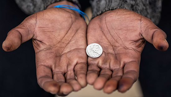
Say hello to Rachelle Kresch! She was the Project Manager on our risk modeling project with Medic, one of our expert partners under our Frontline Health Systems Impact Practice. Rachelle and the rest of the volunteer team worked with Medic to improve maternal and child health in hard-to-reach communities by developing predictive models that proactively determine when Community Health Workers (CHWs) should initiate healthcare interventions.
Rachelle’s a data and analytics leader with extensive experience building and leading cross-functional teams of analysts, data scientists, and engineers. Her experience spans the end-to-end value of data: building foundational data assets and governance processes, creating new analytics teams and processes, generating insights, and measuring business impact. Currently, she’s an Analytics Senior Manager at Autodesk.
Rachelle graduated from UC Berkeley, where she continues to mentor business, statistics, data science, and engineering students. Outside of volunteering, she enjoys trail running and competing in triathlons. We’re excited to introduce you to Rachelle, and we hope you’ll enjoy reading about her journey with Medic in her own words!
Tell us a little bit about yourself and your background.
I lead a team of data analysts at Autodesk where we’re focused on identifying insights to support strategic decisions. Prior to this, I spent nearly a decade as a management consultant in Ernst & Young’s Analytics & Technology groups, where I assisted senior leaders and executives in defining, communicating, and implementing enterprise-wide data and analytics solutions in highly complex organizations.
During graduate school, I heard Jake Porway speak at a DataEDGE conference, and I immediately decided to support this cause as soon as my nights and weekends were free from studying, as I felt that using my data expertise would be the best way I could make an impact on communities.
Can you briefly describe the project that you worked on?
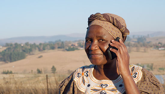
My DataKind team and I worked with Medic, a global nonprofit on a mission to improve health in communities that are hardest to reach. Medic creates open-source, mobile tools and software for use by frontline CHWs to track patients and monitor care. Our team was tasked with developing predictive models to proactively (1) identify sick children, (2) identify mothers at risk of giving birth outside a health facility center, and (3) identify newborns likely to develop danger signs. These models are designed to run on CHWs’ mobile phones during patient visits.
In my role as Project Manager, I was responsible for a number of processes, including roadmap creation to product delivery. I designed processes for the team to collaborate as well as identified how to divide the work into various work streams. Since my role spanned across each work stream, research, and model development, I was able to identify synergies and areas to streamline efforts and reuse methods, code, and identify key themes in our findings. This role was important in shaping the vision, measuring the impact, and communicating results and findings to our partner at Medic.
What surprised you most about this project?
My last DataKind project was made up of local, Bay Area volunteers. When I learned I was going to lead a project with team members from many geographies, I was a bit nervous because volunteers don’t particularly have expectations around when we’re available to ‘work’ like we do at work. Fortunately, by the time the pandemic hit, we already had our operating model and this project was not an extra stressor but an outlet to help at a critical time.
What tips do you have about communicating data science findings to nonprofits most effectively?
Simplicity and clarity in communication is key! I grasp concepts more quickly from visuals. Here are two visualization techniques our team used to communicate results. To visualize which datasets contained our positive and negative classes of data, we used Sankey Diagrams (Figure 1). If you haven’t used a Sankey Diagram, they’re originally used to depict energy efficiency. In our case, we used this tactic to describe our dependent and independent response variables. This was helpful in describing data limitations.
.png)
Figure 1: Sankey Diagram showing the relationship between the dependent class, Danger Signs- Y/N and the categorical variable, Handwashing – Y/N
Once we identified our top models, the team used the python package SHAP to visually rank and describe which inputs had the most influence in our models. Figure 2 is a sample visual where each row corresponds to a feature, ordered from highest to lowest importance. For each row, each sample is identified by a point, whose location on the x-axis corresponds to the impact on model the dependent variable (or model output). SHAP values greater than 0 (or points towards the right) correspond to samples where the feature contributed to an increased probability. Points are color coded by their feature importance. Binary features are shown as unique clusters, one in each color. Using SHAP values allowed us to communicate our final results with specificity vs. suggesting that we used a “black box” (Figure 2).
.png)
Figure 2: SHAP values for gradient boosted trees where each row corresponds to a feature, ordered in terms of feature importance.
What’s your experience been collaborating with other volunteers on the project and/or working with the DataKind Global staff?
My team and the DataKind staff are such inspiring people to work alongside and learn from! While I have a background in analytics and using data to support the nonprofit sector, this was my first experience working in the healthcare space. I was able to learn quite a bit from both the volunteers and the DataKind staff.
What advice would you like to share with volunteers who are new to DataKind or the Data for Good movement?
Always remember what drew you to support DataKind and Data for Good and assume positive intentions. If the team is unable to iterate as quickly during a specific sprint cycle as you, that’s okay! As a project manager that needed to work collaboratively to ensure processes were moving along, being open and flexible to my team’s different schedules and responsibilities was helpful.
What does “living with a sense of purpose” mean to you?
To me, a purpose should stick with you regardless of your project, job, relationship status, etc. My purpose is to “inspire unique perspectives so that people are empowered to forge their own path.” I live by this purpose at all times – at work, my volunteer projects, and with family and friends.
What’s the best concert you ever attended?
Andrew McMahon – not only is his personal triumph of leukemia an inspiration, he interacts with his audience via a rainbow play parachute, which brings you back to your carefree, younger days.