World Bank |  Washington DC
Objectives
- Visualize nighttime illumination history over interesting and relevant datadriven maps.
- Find out if there is a connection between poverty and nighttime illusion that might be helpful in addressing poverty.
- Create a model for building other data relationships that offer the opportunity to react quickly to surging poverty.
Findings
- The team, using regression modeling, did find a correlation between 2001’s lighting data and that year’s poverty levels.
- The same didn’t hold true for 2005. There very well could be other mitigating factors that disrupted the connection, but there wasn’t enough time during the DataDive to explore them.
- Despite the lack of conclusion on the 2005 data, we believe location-based geospatial poverty data can be combined with other geospatial and visual data to probe relationships between economic factors
Question
Information can be very valuable. But it loses value with age. It becomes history, and less of a tool for change.
What value does information about poverty have? Well, when it’s timely—which historically poverty data has not been—that information can trigger reactions: in monetary policy, in foreign aid, in any imaginable channel of support. Time can mitigate starvation and disease, and save untold lives.
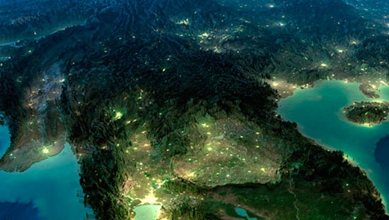
So we wanted to know: What kind of data could be secured easily, cheaply, and quickly that might provide nearly real time analysis on poverty? We thought the answer might be written in the lights.
What Happened
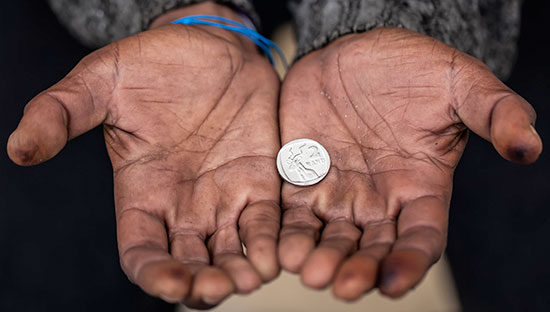
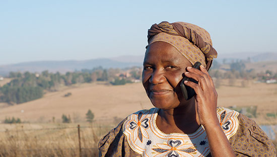
In March 2013, a crack staff of 120 pro bono data aces assembled in Washington, DC, for the World Bank DataDive. Included among several amazing projects was an undertaking to identify a correlation between the poverty in Bangladesh over a period of time and the levels of illumination as seen from satellite images. Poverty is rife in this South Asian country, where about half the population lives on the equivalent of a dollar a day.
The team assigned to this project grabbed poverty data from 2001 and 2005 and satellite images of illumination including and between those years. The challenge was to mash it all up into something meaningful. Prior to the event, the team built some tools for merging GeoTIFFs and Shapefiles. And during the event, the team folded the actual satellite data from the National Oceanic and Atmospheric Administration along with Bangladeshi geo-coding information to create visualizations of this data.
What’s Next
We think that the World Bank should continue to dig deeper on this project, starting with using more recent poverty information. And further discussions between the World Bank team and the data ambassadors on this project might yield some models or techniques that make more sense and could unearth deeper connections between illumination and poverty that explain the gap in the 2005 data.
While we didn’t get the strong link that year between illumination and poverty that we’d hoped for, we did confirm that there’s serious analytical power in geospatial visualization of data, making this project incredibly valuable. The modeling built by DataKind’s volunteer scientists is there for the future. With additional data sources, we can turn this type of visualization process into a tool that can work with a broad array of economic factors and have a lasting impact on fighting poverty.